CASE STUDY
Connecting creators to brands, fans, and better ideas
THE PROBLEM
Why don't creators stick to their Youtube careers? 🤔
Youtube is a great way to grow your career or personal brand. However, most people who would love to be Youtubers never start their Youtube careers, and even those who do drop off and don't stick to it. Why?
Clearly, something separates those who succeed at Youtube from those who don't. To find that factor, I interviewed six content creators, scoured content creator discussion forums, and tracked down the data on when Youtubers often drop off the map.
The same pattern kept showing up. Aspiring Youtubers either dropped off early on (3-7 videos in), when Youtube began to feel like too much work for too little value-- or later on (perhaps 20+ videos in), when the ambiguity of not knowing what might be a hitleads to burnout and fatigue.
That led me to formulate two personas:
THE BEGINNER (3-7 VIDEOS)
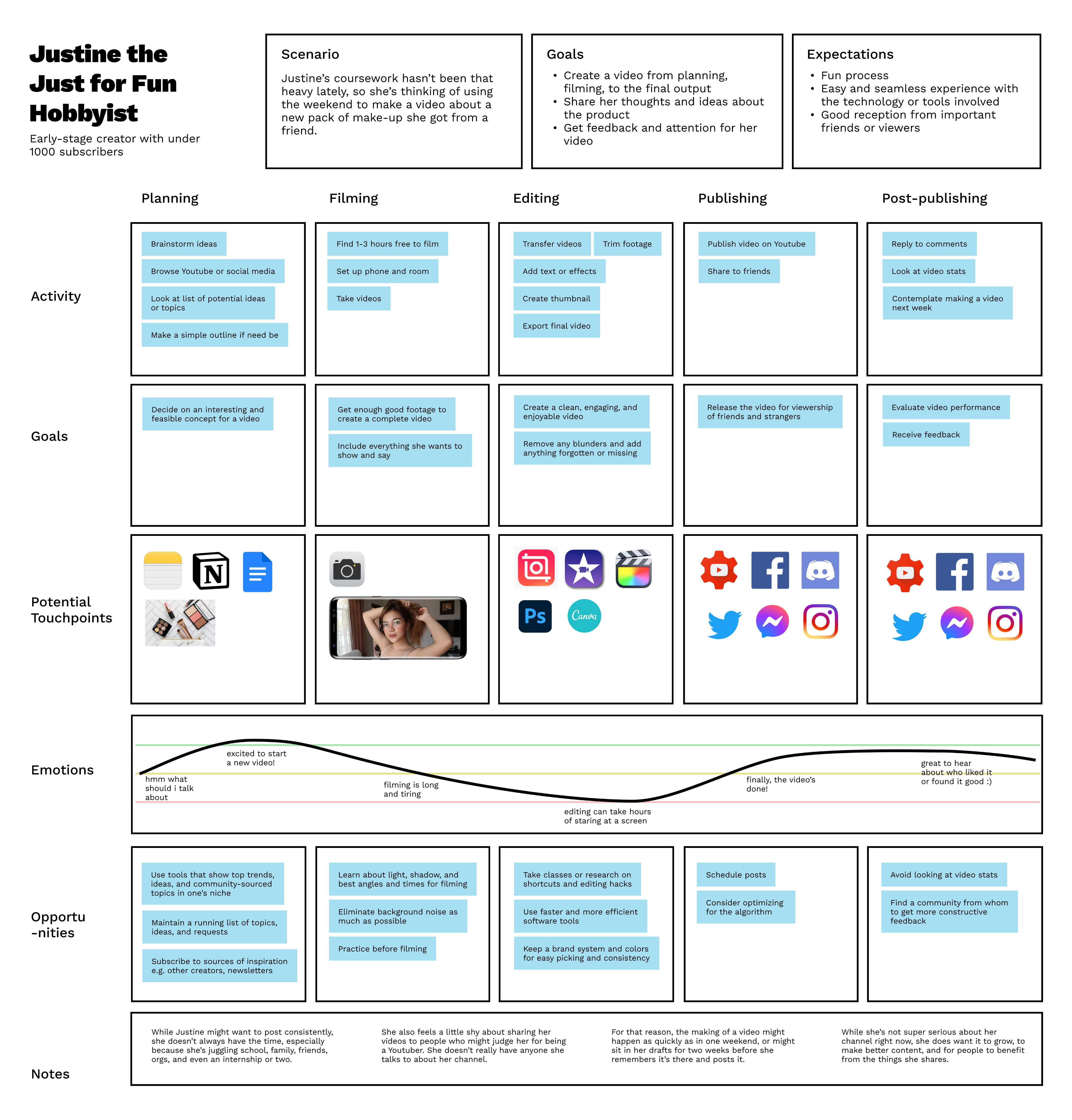
Justine the Hobbyist
College student by day, Youtuber for around 200 friends and family... whenever she finds the time, or has a spare weekend.
PAIN POINTS
Coming up with more or higher-quality content is just way too much work. Why stay consistent?

THE ADEPT (20+ VIDEOS)
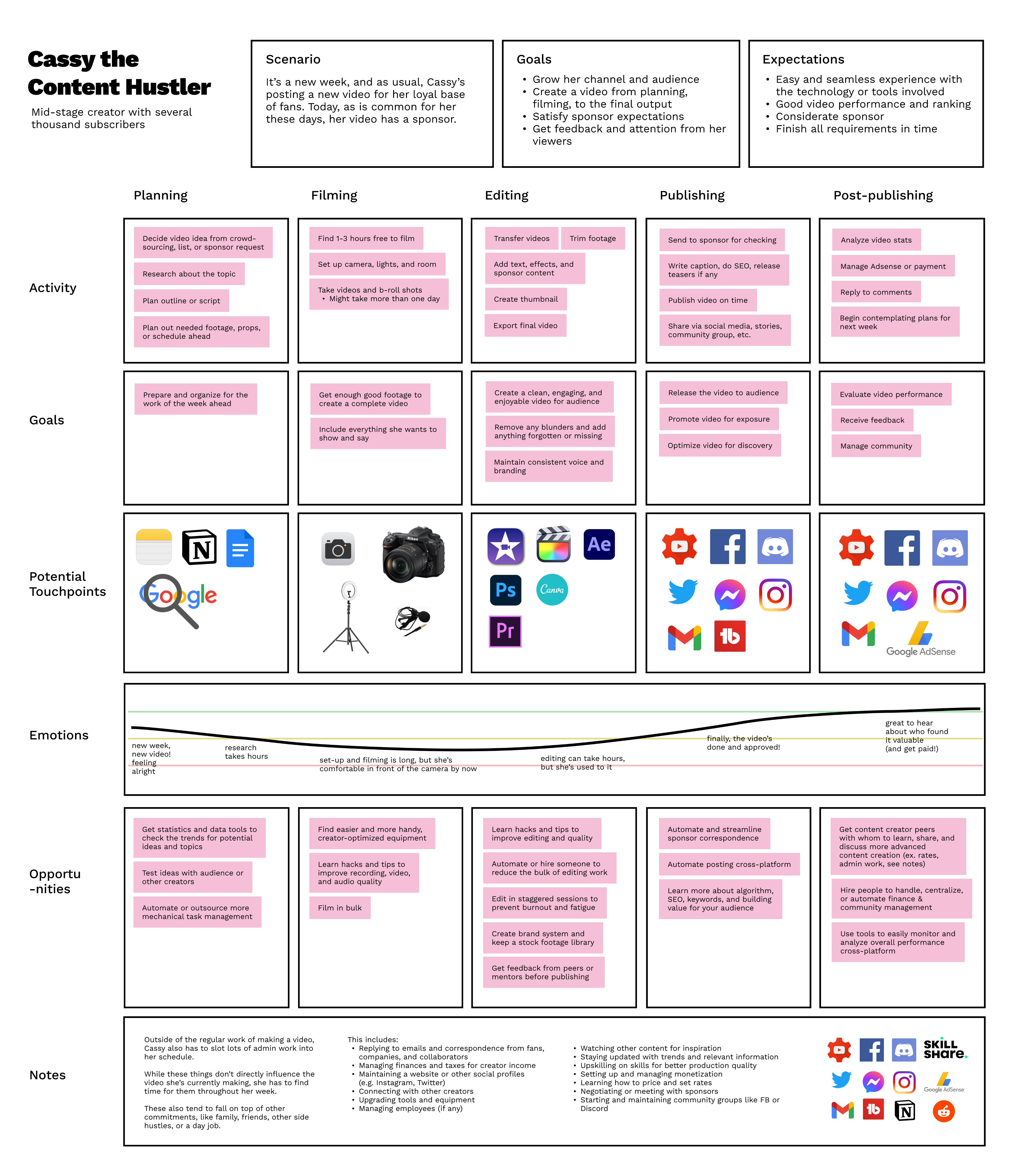
Cassy the Creator
Works a day job, but she's had a kinda-hit video, and she just reached 1000 subscribers! Maybe in a few months she can monetize...
PAIN POINTS
It's hard to make content week after week not knowing what will make it big. How can she grow?
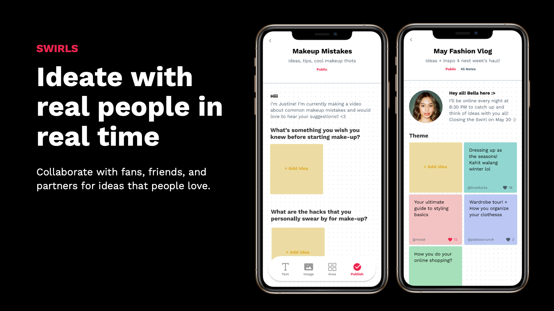
For these personas, feedback was critical. Creators often just need a tiny nudge: from fans, brands, or fellow creators who help them through a tough spot, thank them for adding value, or motivate them to keep going.
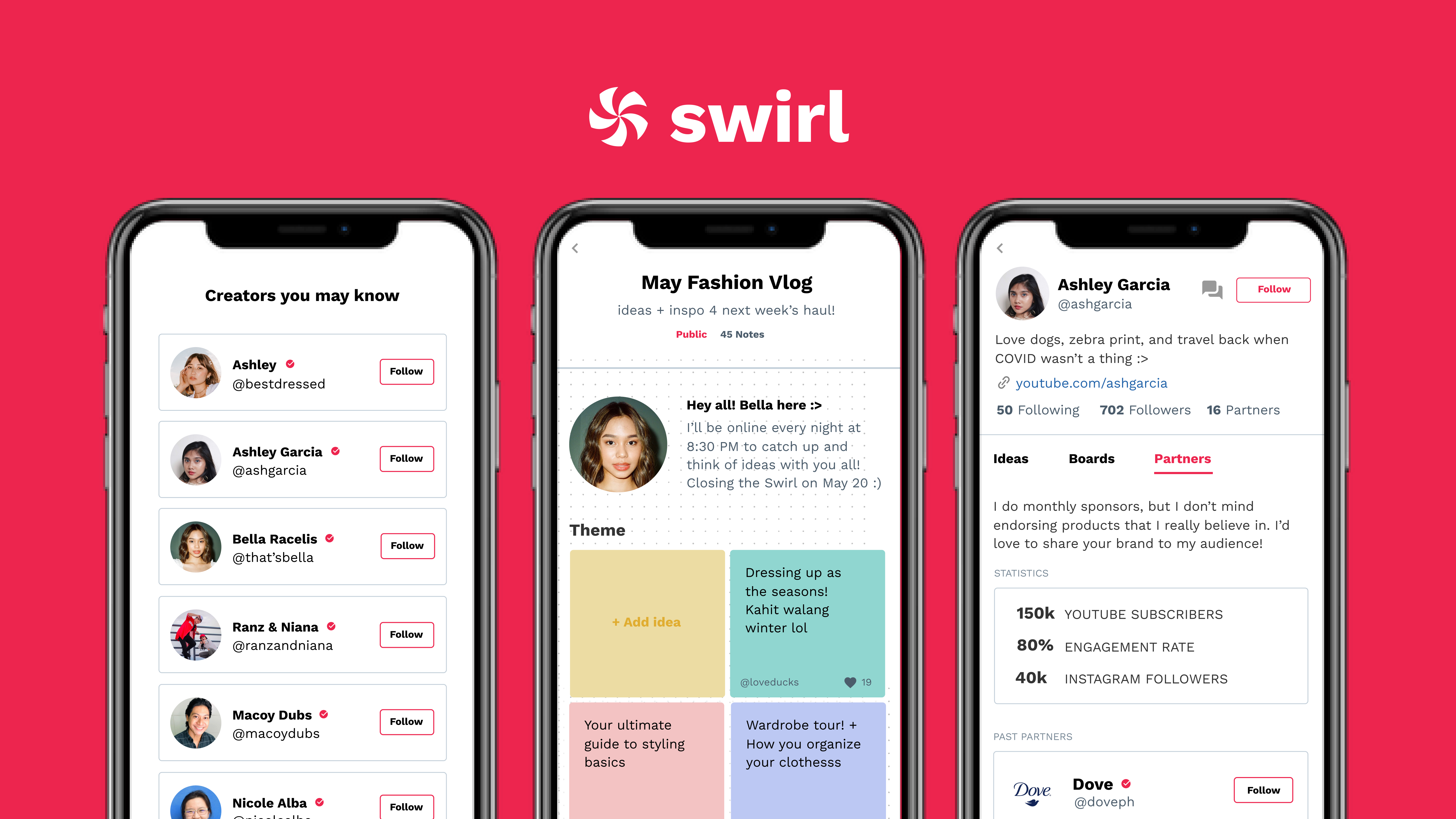
SOLUTION V1
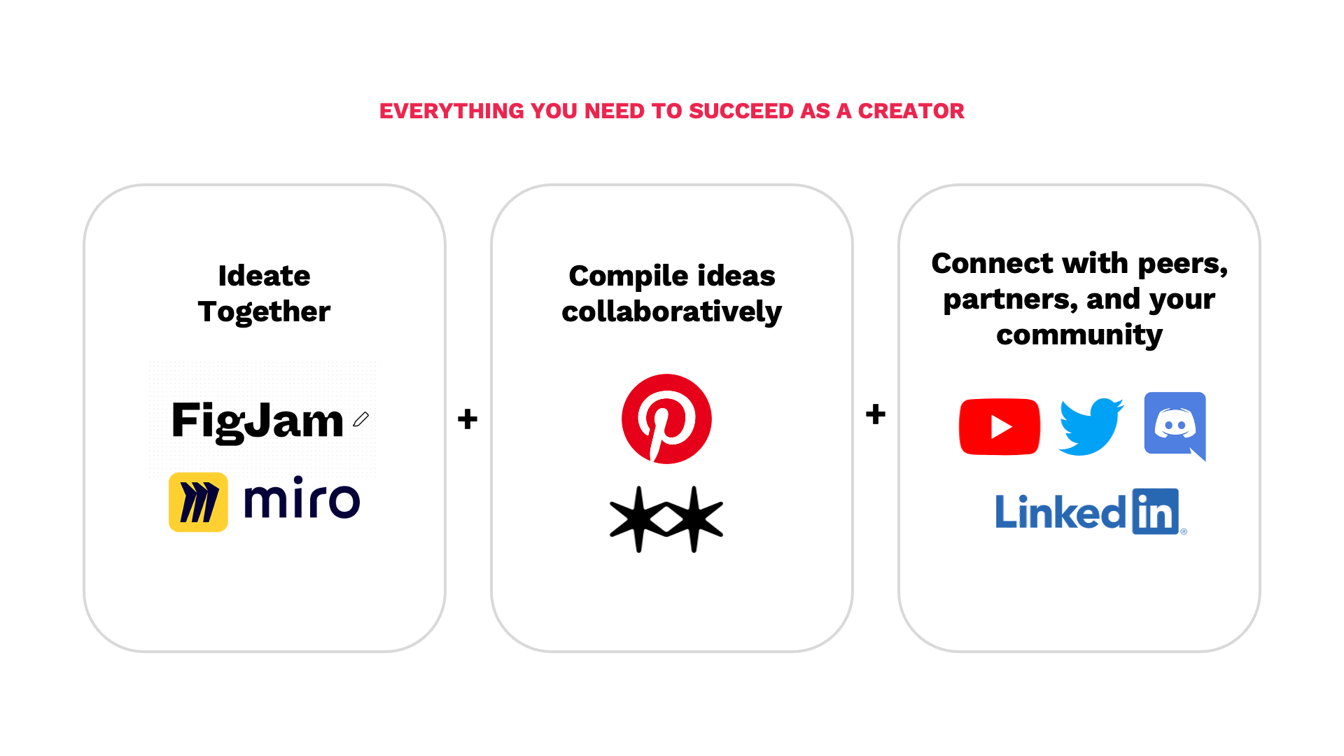
The all-in-one tool for content creators
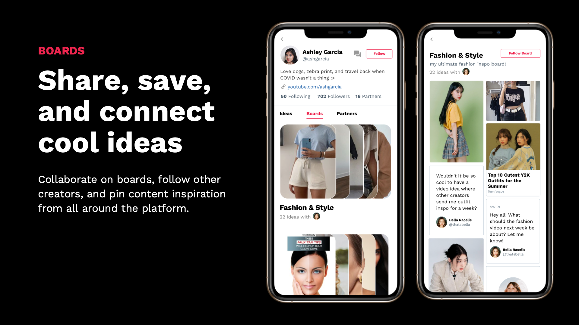
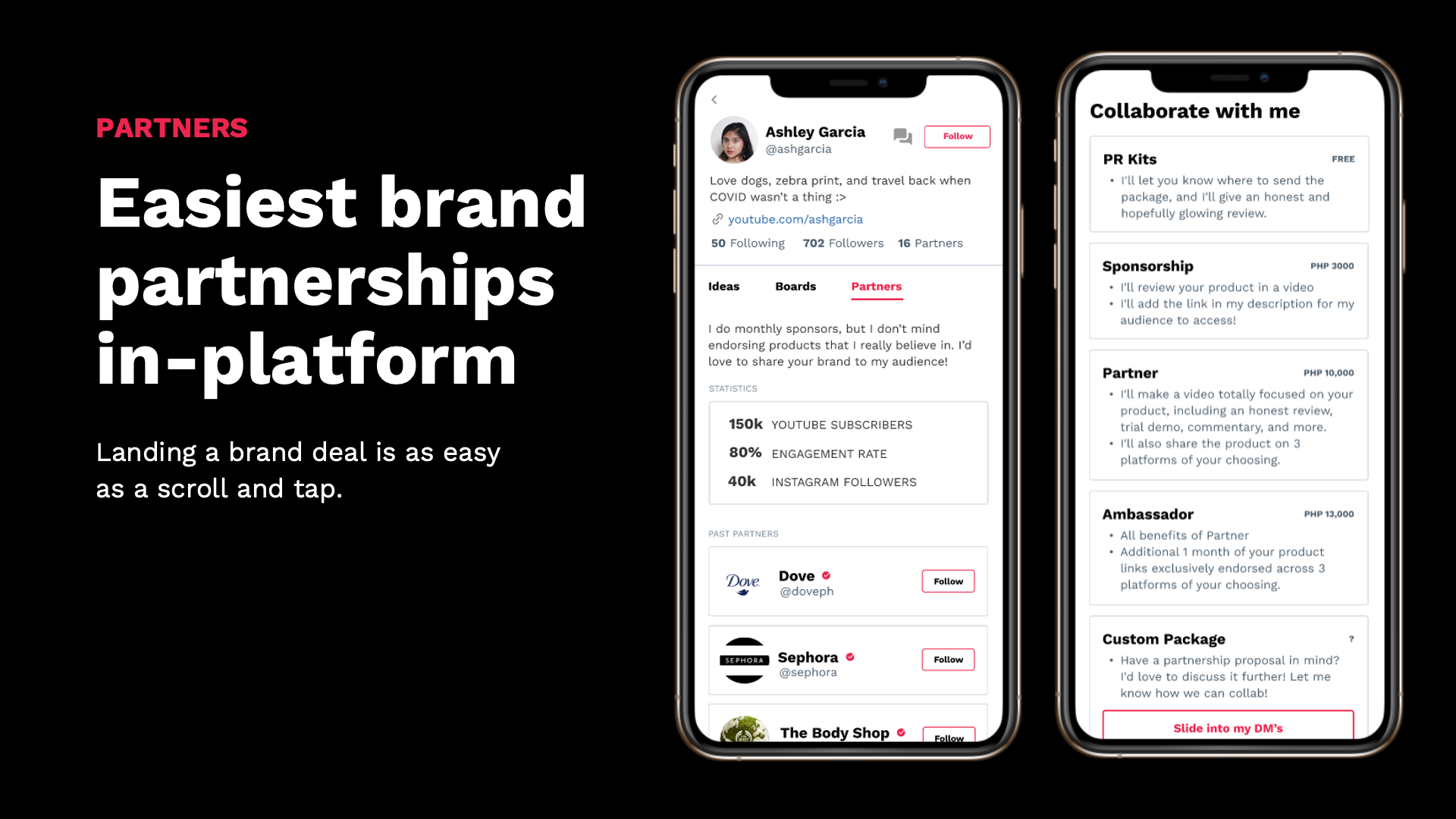
Young, naive me envisioned Swirl as an all-in-one platform for creators to get feedback on everything. To this end, I worked on my value proposition, information architecture, wireframes, and prototypes.
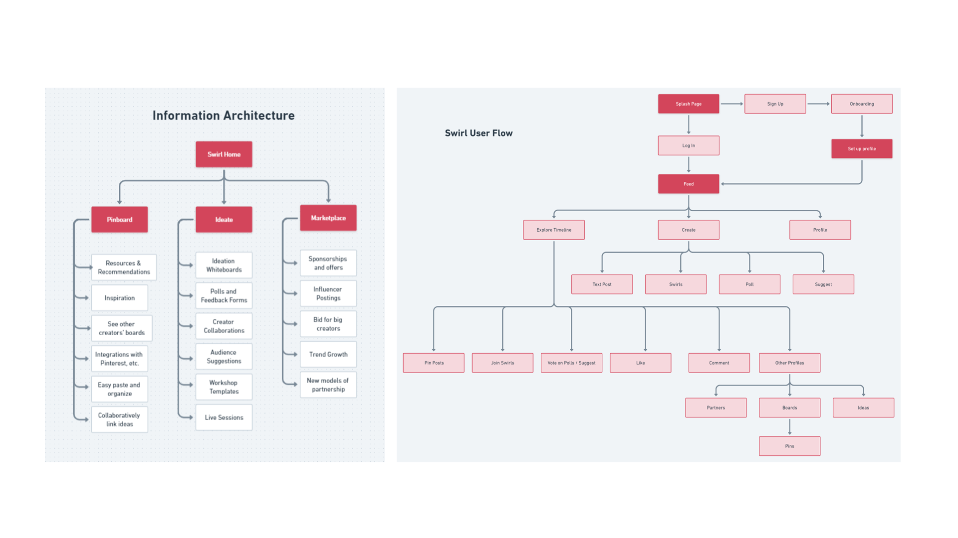
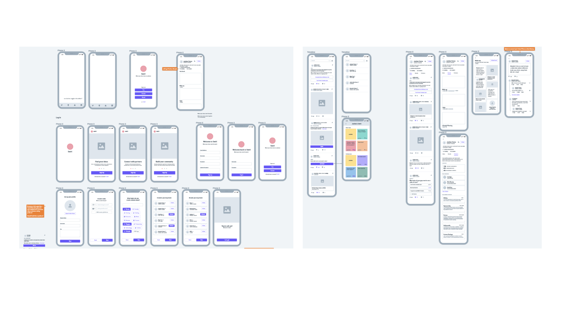
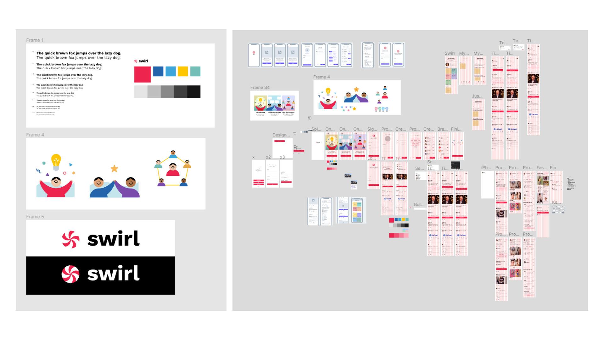
I was lucky -- I pitched my final output to the judges and won, probably because I had such a distinct and expansive concept.
If you want to see what a seventeen-year-old had up her sleeve within her first month of learning UX, here's the deck and pitch.
Despite the veneer of victory, I knew that Swirl wasn't battle-tested. In fact, the product was bloated with features, without adding much real value.
THINGS I LEARNED
V1 had three glaring problems.
This project was good for a short sprint, but it had major shortcomings. In a future iteration of this product, I would do many things differently and take the following limitations of the current product into consideration.
01
Unfocused
What kinds of feedback are the most critical to keep Justine and Cassy going? Swirl V1 had no clue, and tried to solve for everything. Instead of trying to solve all of my creators' problems, I should have picked one and tested it in the real world.
02
Infeasible
Swirl wasn't very feasible given all functions, roles, and interactions I was squeezing in. If implemented, it would be full of bugs and probably languish in development hell forever.
03
Unpolished
I definitely had to improve Swirl's overall visual design. It just wasn't on par with what modern consumers demand from a slick, professional product.