TAKEAWAYS
A lot more goes into email nudges than I had initially thought.
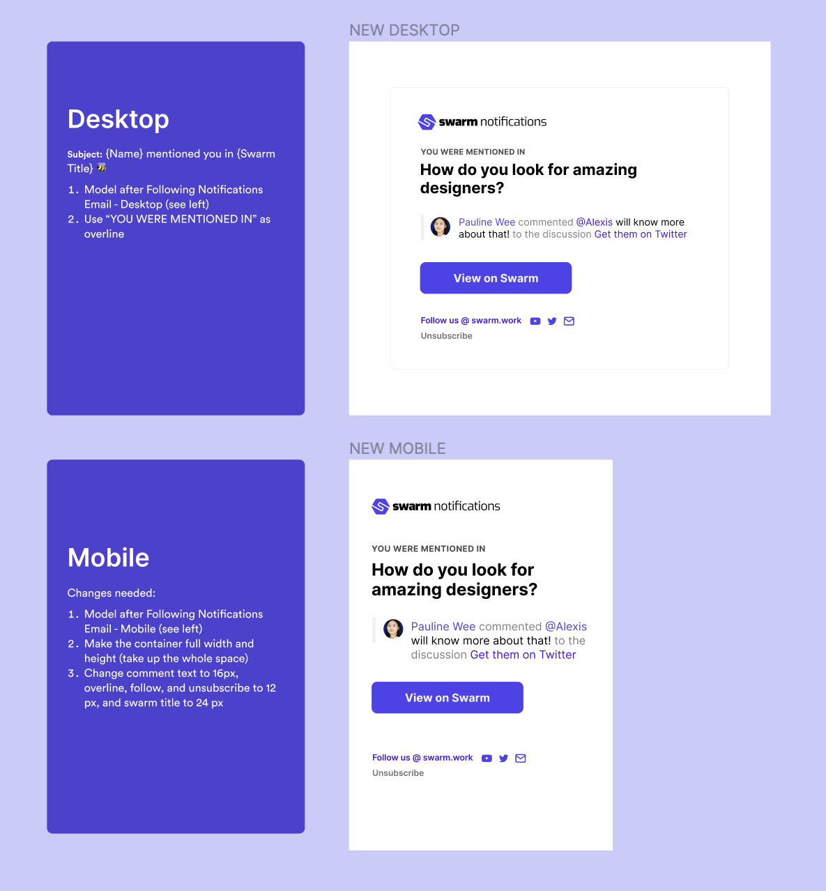
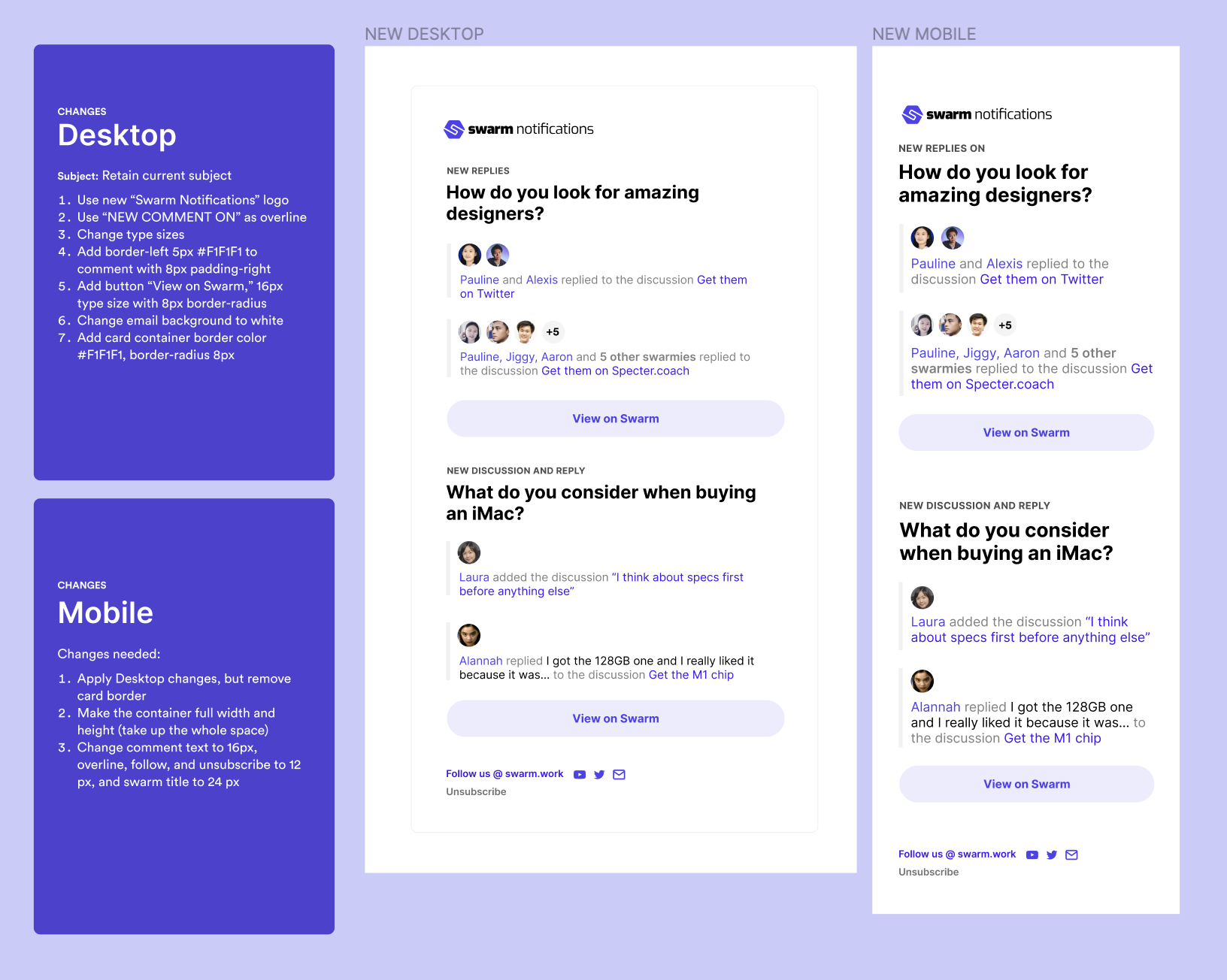
Aside from designing the emails themselves for desktop, mobile, and dark mode, I also had to think about the subject lines and subtitles, the frequency and schedule of the nudges for a global user base, and what would compel a user to actually go to Swarm.
A few specific takeaways from the experience:
01
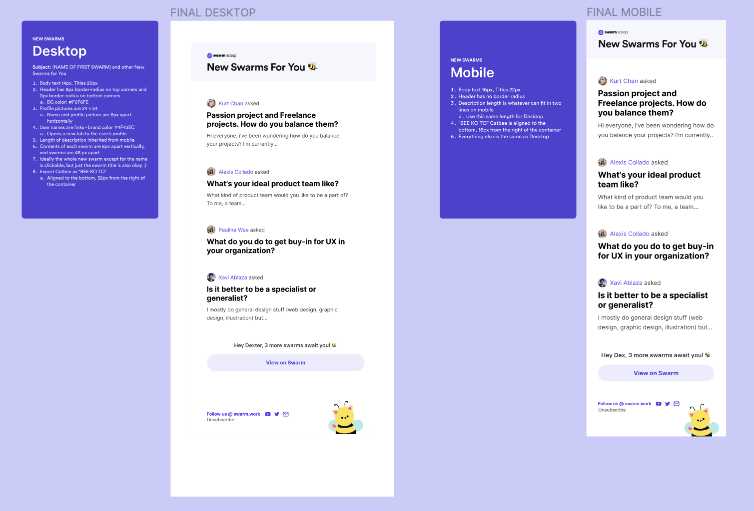
Visual hierarchy is extremely important.
If everything is important, nothing is important. Shrinking down unimportant information allows users to focus on what's most important.
02
Direct eyes to the Call to Action
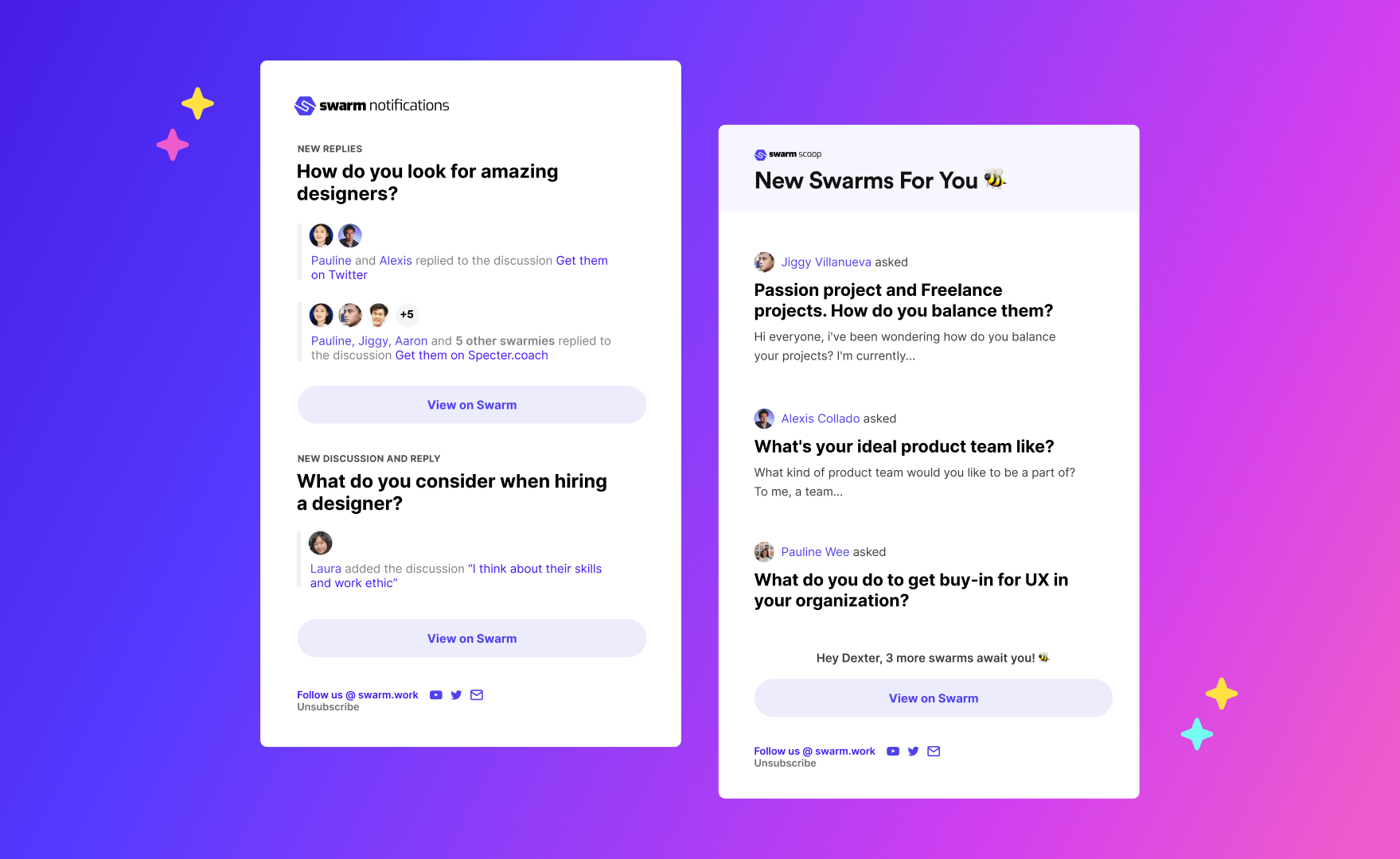
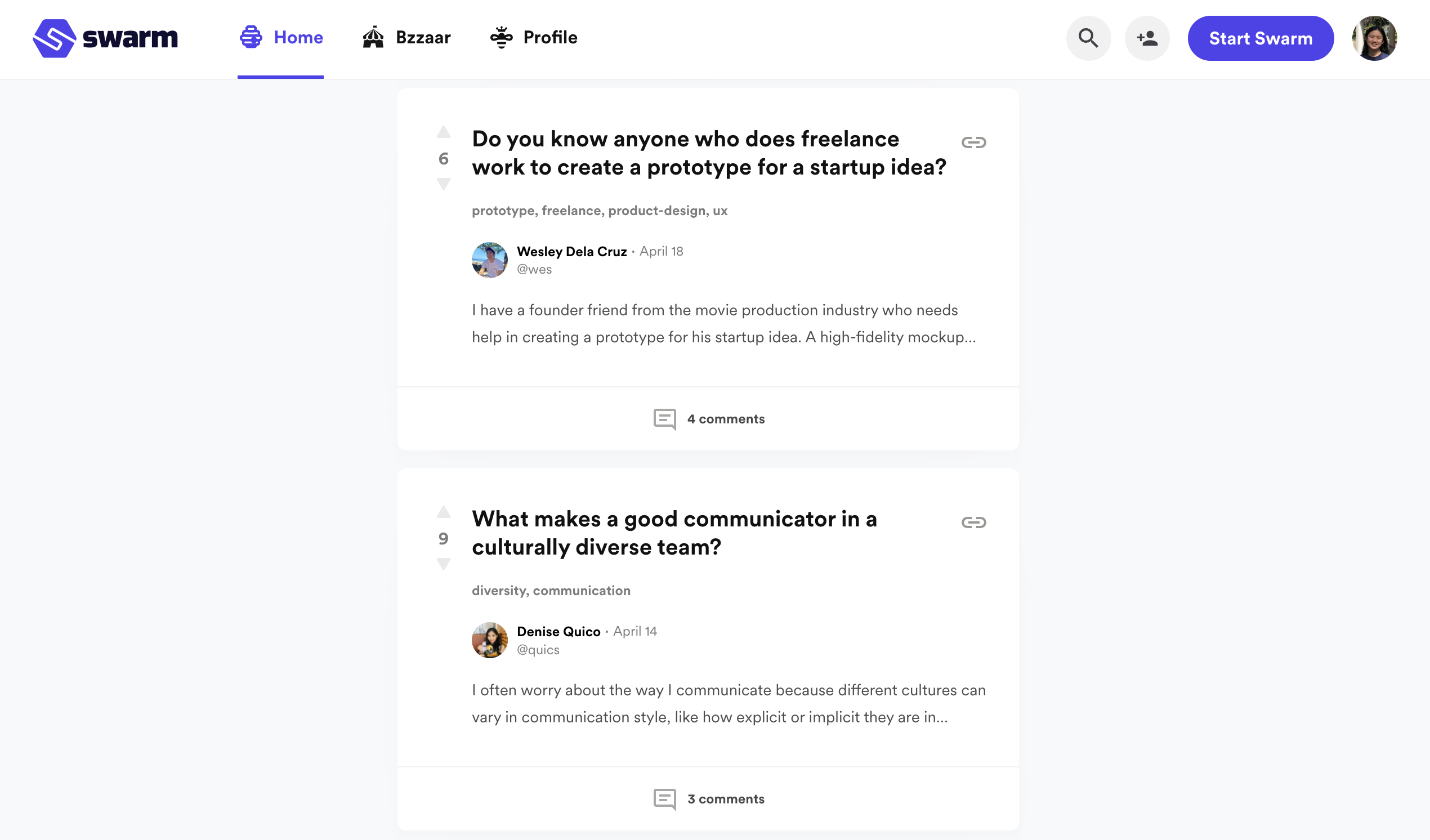
The most important button in all our emails was "View on Swarm". All the other content in the page was designed for the goal of pushing people to click that button.
03
Aesthetics make the difference
Tiny touches like friendly copy, good spacing, profile pictures, and hints of our mascot and brand color encourage the user to actually read through the email.
In the future, I'd want to improve on this system by doing more user research and usability testing, as well as iterating the design based on data about user retention.
I'd also love to try A/B tests to see whether changes in the subject copy (e.g. citing a specific new swarm each time rather than "New Swarms for You") would lead to a higher open and click rates.